
Blog Post5 min read
How to Choose the Right Color Palette for Your Brand
A
AnalogJuly 2, 2025
How to Choose the Right Color Palette for Your Brand
“Colors, like features, follow the changes of the emotions.”
— Pablo Picasso
Whether you’re building a startup, designing packaging, or refreshing a nonprofit’s visual identity, your color palette isn’t just aesthetic. It’s psychological. Strategic. Emotional. And when chosen carefully, it can become one of the most powerful tools in your brand toolkit.
In this guide, we’ll explore the role of color in branding, the psychology behind it, and how to develop a palette that aligns with your brand’s personality and goals.

Why Color Matters in Branding
Color is perception, not just ornamentation.
According to studies, color affects decision-making and emotional reactions while increasing brand recognition by up to 80%. The human brain processes visuals 60,000 times faster than text. In a saturated market, color becomes a shortcut to meaning.
The Psychology of Color: What Emotions Do Colors Evoke?
Color psychology explores how different hues influence perception, behavior, and feelings. While interpretations may vary across cultures, for example, Red is a lucky color in Chinese culture; however, in Indian culture, red is an auspicious color worn by the bride on her wedding day.
The following associations are widely recognized in global marketing:
Red
- Meaning & Associations: Passion, urgency, strength
- Common Uses: Food, sales, activism
- Brand Examples: Coca-Cola, YouTube, CNN
Orange
- Meaning & Associations: Creativity, enthusiasm, friendliness
- Common Uses: Youth brands, tech, innovation
- Brand Examples: Fanta, SoundCloud, Firefox
Yellow
- Meaning & Associations: Optimism, clarity, warmth
- Common Uses: Hospitality, education, children’s brands
- Brand Examples: McDonald's, Snapchat
Green
- Meaning & Associations: Health, growth, stability
- Common Uses: Finance, environment, wellness
- Brand Examples: Whole Foods, Spotify
Blue
- Meaning & Associations: Trust, professionalism, calm
- Common Uses: Technology, healthcare, corporate
- Brand Examples: IBM, Facebook, PayPal
Purple
- Meaning & Associations: Luxury, creativity, spirituality
- Common Uses: Beauty, high-end goods, culture
- Brand Examples: Cadbury, Hallmark
Black
- Meaning & Associations: Sophistication, power, elegance
- Common Uses: Fashion, luxury, premium services
- Brand Examples: Chanel, Nike
White
- Meaning & Associations: Simplicity, clarity, neutrality
- Common Uses: Minimalist brands, tech, wellness
- Brand Examples: Apple, Tesla
Step-by-Step: How to Choose the Right Colors for Your Brand
Brand color choices are not simply about preference; they are about alignment. Below is a structured approach to developing a palette that is aesthetically effective and strategically aligned.
1. Define Your Brand Personality
Start by outlining the core traits of your brand. If your brand were a person, how would it speak? Dress? Behave?
Try this exercise:
- Choose 3–5 adjectives to describe your brand (e.g., bold, empathetic, innovative)
- Decide on your tone: formal or casual? Feminine or neutral? Quiet or expressive?
- Identify key values (e.g., trust, sustainability, disruption)
These descriptors will act as filters for your color decisions.
Example:
A mental health app might choose soft blues and greens to represent calm, trust, and healing. A music festival might opt for vivid oranges and purples to express excitement and creativity.
You can always use the color wheel as a strategic tool, not just for artists, but for brands aiming to create a balanced, effective palette. It helps you understand how colors interact, contrast, or complement each other, which is key to making sure your brand feels cohesive and visually strong across all mediums.

2. Understand Your Audience
Color perception is affected by age, gender, culture, and industry expectations. Consider your audience's background and preferences. For example:
- Younger demographics often favor brighter, saturated tones
- Older audiences may prefer muted, refined palettes
- Middle Eastern and Asian markets have different color symbolism than Western markets
Avoid making assumptions—test your choices when possible.
3. Analyze the Competition
Look at the color trends in your industry—but don’t simply blend in. Study competitors to:
- Identify dominant color schemes
- Note what works and what feels overused
- Find gaps or contrasts to help you stand out
Standing out does not mean choosing wild colors—it means choosing colors that are differentiated and authentic to your mission.
4. Build Your Color Palette
A functional brand palette usually consists of:
- Primary Color: Dominant color, used most frequently (e.g., logo, buttons, packaging)
- Secondary Color(s): Adds depth and contrast; used for highlights or alternate design areas
- Neutral Colors: Used for backgrounds, typography, and layout balance (e.g., greys, off-whites)
Make sure your palette works in digital and print, on dark and light backgrounds, and with text overlays.
5. Name Your Colors (Strategically or Creatively)
Naming your brand colors can support internal consistency and storytelling.
- Functional names: “Primary Blue,” “Neutral Gray,” “Accent Green”
- Creative names: “Midnight Sea,” “Sunlit Clay,” “Rose Smoke”
If you're building a full brand identity system or style guide, these names are invaluable for collaboration with designers, marketers, and content creators.
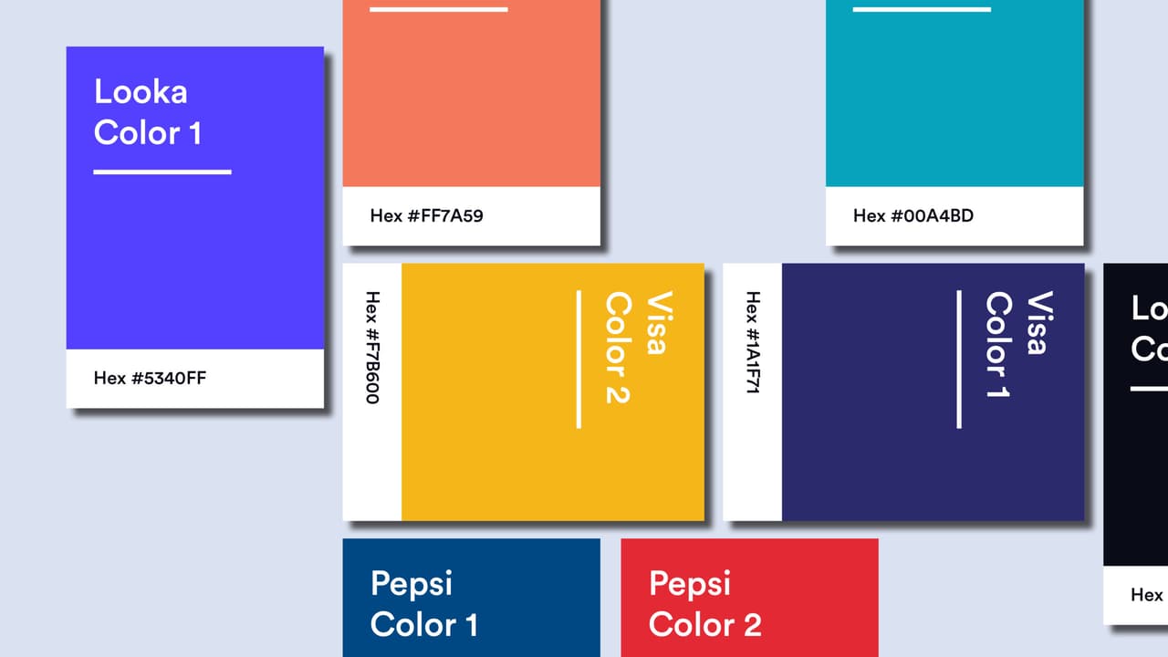
Famous Brand Color Examples and What We Can Learn
Netflix: Their vibrant red, often paired with black, evokes energy, passion, and excitement, fitting for an entertainment brand.

Airbnb: Shifted from a generic blue to a warm coral pink to humanize the platform and stand out in tech.

Spotify: Green may seem unexpected in tech, but it reinforces their brand as fresh, unconventional, and playful.

Starbucks: The dark green represents growth, nature, and freshness, reflecting their commitment to quality coffee and natural ingredients.

Final Thoughts
Color is not a secondary element of your brand; it is one of your most influential assets.
When chosen with purpose, your brand colors:
- Build emotional trust
- Differentiate yourself from competitors
- Create visual consistency across platforms
Whether you're launching a new brand or refreshing an existing one, the time you invest in developing a strategic color palette will return to you tenfold—in attention, recognition, and loyalty.
Tags:DesignBrandingCreativeMarketingStrategy
A
Analog Company
A modern digital agency with expertise in creating content that engages and converts.
Related Articles
Enjoyed this article?
Subscribe to our newsletter to receive the latest insights directly to your inbox.
We respect your privacy. Unsubscribe at any time.