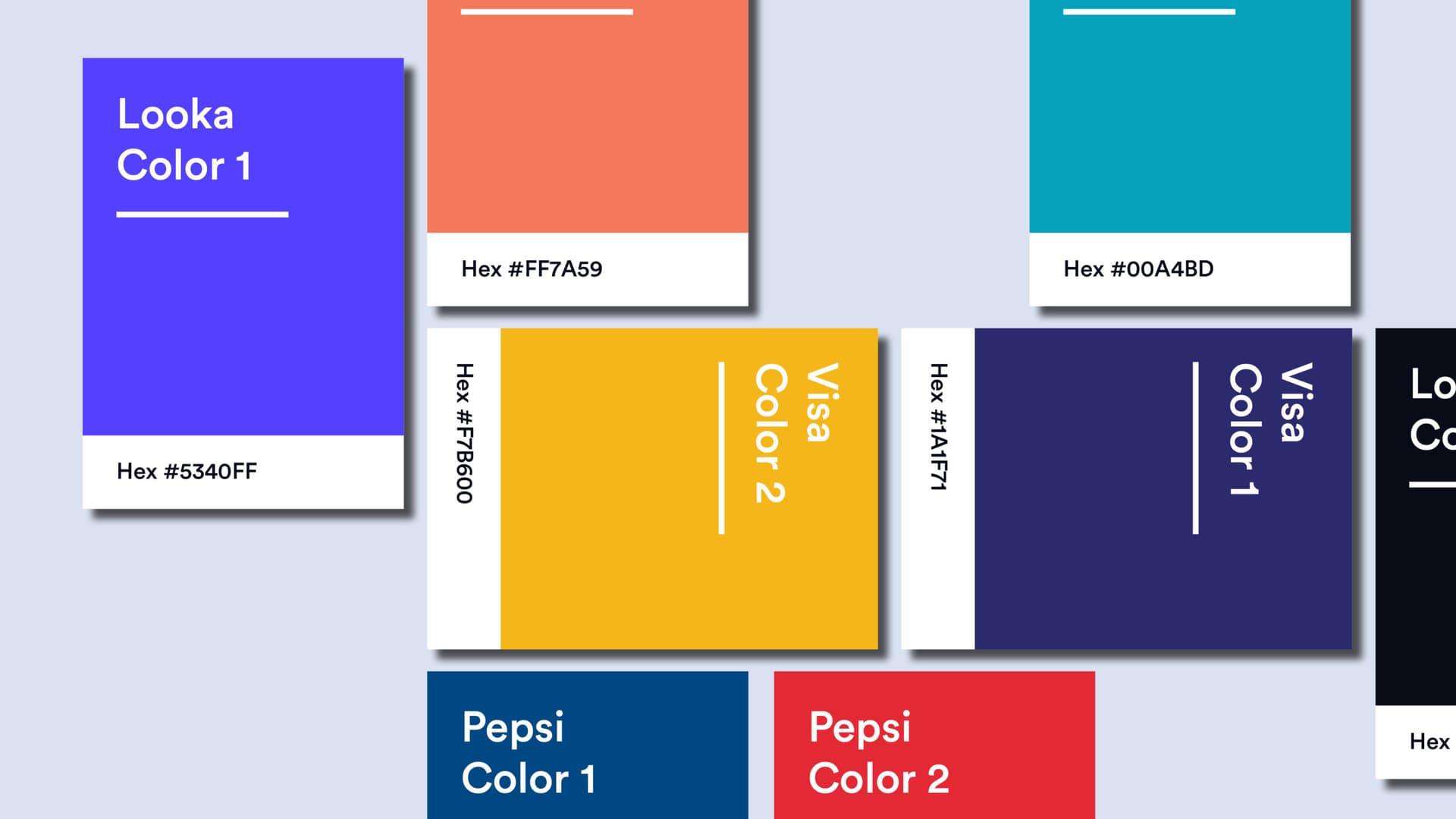
"A brand is a person's gut feeling about a product, service, or company."
Marty Neumeier, The Brand Gap
"Logo" and "brand" are often used as if they mean the same thing. They describe two different things, and mixing them up leads to misplaced budgets, unrealistic expectations and rebrands that change the surface while leaving the real problem in place.
The Short Definitions
Logo: a symbol, wordmark or combination of both, used to identify a company.
Brand: the sum of perceptions, expectations and feelings people hold about that company.
A logo is designed and delivered. A brand is earned and accumulated, one interaction at a time.
}to{transform:translateX(-160px)}}
%23wave{animation:wv 2.5s linear infinite}[class*=k]{animation-duration:10s;animation-iteration-count:infinite;animation-timing-function:cubic-bezier(.25,.8,.3,1)}.oc{transform-box:fill-box;transform-origin:center}.ol{transform-box:fill-box;transform-origin:left center}@keyframes k0{0%25{opacity:0}12%25{opacity:0}26%25{opacity:1}92%25{opacity:1}98%25{opacity:0}100%25{opacity:0}}
.k0{animation-name:k0}@keyframes k1{0%25{opacity:0;transform:scale(.2)}12%25{opacity:0;transform:scale(.2)}28%25{opacity:1;transform:scale(1)}92%25{opacity:1;transform:scale(1)}98%25{opacity:0;transform:scale(1)}100%25{opacity:0;transform:scale(.2)}}
.k1{animation-name:k1}@keyframes k2{0%25{opacity:0}20%25{opacity:0}28%25{opacity:1}92%25{opacity:1}98%25{opacity:0}100%25{opacity:0}}
.k2{animation-name:k2}@keyframes k3{0%25{opacity:0;transform:translateY(14px)}30%25{opacity:0;transform:translateY(14px)}36%25{opacity:1;transform:translateY(0)}92%25{opacity:1;transform:translateY(0)}98%25{opacity:0;transform:translateY(0)}100%25{opacity:0;transform:translateY(14px)}}
.k3{animation-name:k3}@keyframes k4{0%25{opacity:0;transform:translateY(14px)}33.2%25{opacity:0;transform:translateY(14px)}39.2%25{opacity:1;transform:translateY(0)}92%25{opacity:1;transform:translateY(0)}98%25{opacity:0;transform:translateY(0)}100%25{opacity:0;transform:translateY(14px)}}
.k4{animation-name:k4}@keyframes k5{0%25{opacity:0;transform:translateY(14px)}36.4%25{opacity:0;transform:translateY(14px)}42.4%25{opacity:1;transform:translateY(0)}92%25{opacity:1;transform:translateY(0)}98%25{opacity:0;transform:translateY(0)}100%25{opacity:0;transform:translateY(14px)}}
.k5{animation-name:k5}@keyframes k6{0%25{opacity:0;transform:translateY(14px)}39.6%25{opacity:0;transform:translateY(14px)}45.6%25{opacity:1;transform:translateY(0)}92%25{opacity:1;transform:translateY(0)}98%25{opacity:0;transform:translateY(0)}100%25{opacity:0;transform:translateY(14px)}}
.k6{animation-name:k6}@keyframes k7{0%25{opacity:0;transform:translateY(14px)}42.8%25{opacity:0;transform:translateY(14px)}48.8%25{opacity:1;transform:translateY(0)}92%25{opacity:1;transform:translateY(0)}98%25{opacity:0;transform:translateY(0)}100%25{opacity:0;transform:translateY(14px)}}
.k7{animation-name:k7}@keyframes k8{0%25{opacity:0;transform:translateY(14px)}46%25{opacity:0;transform:translateY(14px)}52%25{opacity:1;transform:translateY(0)}92%25{opacity:1;transform:translateY(0)}98%25{opacity:0;transform:translateY(0)}100%25{opacity:0;transform:translateY(14px)}}
.k8{animation-name:k8}@keyframes k9{0%25{opacity:0;transform:translateY(14px)}49.2%25{opacity:0;transform:translateY(14px)}55.2%25{opacity:1;transform:translateY(0)}92%25{opacity:1;transform:translateY(0)}98%25{opacity:0;transform:translateY(0)}100%25{opacity:0;transform:translateY(14px)}}
.k9{animation-name:k9}@keyframes k10{0%25{opacity:0;transform:translateY(14px)}52.4%25{opacity:0;transform:translateY(14px)}58.4%25{opacity:1;transform:translateY(0)}92%25{opacity:1;transform:translateY(0)}98%25{opacity:0;transform:translateY(0)}100%25{opacity:0;transform:translateY(14px)}}
.k10{animation-name:k10}@keyframes k11{0%25{opacity:0;transform:translateY(14px)}55.6%25{opacity:0;transform:translateY(14px)}61.6%25{opacity:1;transform:translateY(0)}92%25{opacity:1;transform:translateY(0)}98%25{opacity:0;transform:translateY(0)}100%25{opacity:0;transform:translateY(14px)}}
.k11{animation-name:k11}@keyframes k12{0%25{opacity:0;transform:translateY(14px)}58.8%25{opacity:0;transform:translateY(14px)}64.8%25{opacity:1;transform:translateY(0)}92%25{opacity:1;transform:translateY(0)}98%25{opacity:0;transform:translateY(0)}100%25{opacity:0;transform:translateY(14px)}}
.k12{animation-name:k12}@keyframes k13{0%25{opacity:0;transform:translateY(14px)}62%25{opacity:0;transform:translateY(14px)}68%25{opacity:1;transform:translateY(0)}92%25{opacity:1;transform:translateY(0)}98%25{opacity:0;transform:translateY(0)}100%25{opacity:0;transform:translateY(14px)}}
.k13{animation-name:k13}</style>
<defs>
<linearGradient id='sky' x1='0' y1='0' x2='0' y2='1'>
<stop offset='0' stop-color='%23f4f7fc'/>
<stop offset='1' stop-color='%23e7eefa'/>
</linearGradient>
<linearGradient id='sea' x1='0' y1='0' x2='0' y2='1'>
<stop offset='0' stop-color='%23015bd3'/>
<stop offset='1' stop-color='%23012f6e'/>
</linearGradient>
<linearGradient id='ice' x1='0' y1='0' x2='0' y2='1'>
<stop offset='0' stop-color='%23ffffff'/>
<stop offset='1' stop-color='%23dfe8f6'/>
</linearGradient>
<linearGradient id='deep' x1='0' y1='0' x2='0' y2='1'>
<stop offset='0' stop-color='%233f86e6' stop-opacity='.95'/>
<stop offset='1' stop-color='%232a6fd0' stop-opacity='.55'/>
</linearGradient>
<radialGradient id='beamg' cx='.5' cy='.5' r='.5'>
<stop offset='0' stop-color='%23ffffff' stop-opacity='.22'/>
<stop offset='1' stop-color='%23ffffff' stop-opacity='0'/>
</radialGradient>
</defs>
<rect width='1600' height='330' fill='url(%23sky)'/>
<rect y='330' width='1600' height='670' fill='url(%23sea)'/>
<ellipse id='beam' cx='790' cy='640' rx='420' ry='340' fill='url(%23beamg)' class='k1 oc'/>
<path id='wave' fill='none' stroke='%23ffffff' stroke-opacity='.6' stroke-width='3' d='M-200 330 Q -180 336 -160 330 Q -140 324 -120 330 Q -100 336 -80 330 Q -60 324 -40 330 Q -20 336 0 330 Q 20 324 40 330 Q 60 336 80 330 Q 100 324 120 330 Q 140 336 160 330 Q 180 324 200 330 Q 220 336 240 330 Q 260 324 280 330 Q 300 336 320 330 Q 340 324 360 330 Q 380 336 400 330 Q 420 324 440 330 Q 460 336 480 330 Q 500 324 520 330 Q 540 336 560 330 Q 580 324 600 330 Q 620 336 640 330 Q 660 324 680 330 Q 700 336 720 330 Q 740 324 760 330 Q 780 336 800 330 Q 820 324 840 330 Q 860 336 880 330 Q 900 324 920 330 Q 940 336 960 330 Q 980 324 1000 330 Q 1020 336 1040 330 Q 1060 324 1080 330 Q 1100 336 1120 330 Q 1140 324 1160 330 Q 1180 336 1200 330 Q 1220 324 1240 330 Q 1260 336 1280 330 Q 1300 324 1320 330 Q 1340 336 1360 330 Q 1380 324 1400 330 Q 1420 336 1440 330 Q 1460 324 1480 330 Q 1500 336 1520 330 Q 1540 324 1560 330 Q 1580 336 1600 330 Q 1620 324 1640 330 Q 1660 336 1680 330 Q 1700 324 1720 330 Q 1740 336 1760 330 Q 1780 324 1800 330 Q 1820 336 1840 330 Q 1860 324 1880 330 Q 1900 336 1920 330 Q 1940 324 1960 330 Q 1980 336 2000 330 Q 2020 324 2040 330'/>
<path d='M700 330 L752 210 L790 236 L828 160 L872 250 L905 330 Z' fill='url(%23ice)' stroke='%23c9d7ee' stroke-width='2'/>
<path id='mass' d='M640 330 L905 330 L1010 410 L1120 560 L1150 700 L1080 850 L930 935 L700 950 L520 880 L430 740 L455 580 L540 430 Z' fill='url(%23deep)' stroke='%238fb8f2' stroke-opacity='.6' stroke-width='2' class='k0'/>
<text x='80' y='120' class='h' font-size='58' fill='%230f1720'>LOGO</text>
<text x='80' y='170' font-size='28' fill='%234a5568'>What people see</text>
<line x1='330' y1='150' x2='690' y2='250' stroke='%23ff5000' stroke-width='3' stroke-dasharray='8 8'/>
<circle cx='696' cy='252' r='8' fill='%23ff5000'/>
<text x='1520' y='120' text-anchor='end' font-size='24' fill='%234a5568' letter-spacing='3'>ABOVE THE SURFACE</text>
<text x='1520' y='160' text-anchor='end' font-size='26' fill='%230f1720'>Symbol · Wordmark · Colours</text>
<g id='brandlbl' class='k2'>
<text x='80' y='440' class='h' font-size='58' fill='%23ffffff'>BRAND</text>
<text x='80' y='490' font-size='28' fill='%23cfe0fa'>What people feel</text>
<text x='1520' y='940' text-anchor='end' font-size='24' fill='%23cfe0fa' letter-spacing='3'>BELOW THE SURFACE</text>
</g>
<g id='words' font-size='30' fill='%23ffffff' font-weight='600' text-anchor='middle'>
<text x='790' y='420' class='k3'>Purpose</text>
<text x='640' y='500' class='k4'>Values</text>
<text x='930' y='500' class='k5'>Promise</text>
<text x='800' y='580' class='k6'>Positioning</text>
<text x='590' y='600' class='k7'>Tone of voice</text>
<text x='1020' y='610' class='k8'>Service</text>
<text x='620' y='690' class='k9'>Customer experience</text>
<text x='960' y='710' class='k10'>Reputation</text>
<text x='700' y='790' class='k11'>Culture</text>
<text x='900' y='800' class='k12'>Consistency</text>
<text x='800' y='880' class='k13'>Trust</text>
</g>
</svg>)
The logo sits above the surface. Everything below it forms the brand.
"Your brand is what other people say about you when you're not in the room."
Attributed to Jeff Bezos, Amazon
Side by Side
'>
<circle r='30' fill='%23ffffff' fill-opacity='.18'/>
<circle r='18' fill='%23ffffff' fill-opacity='.35'/>
<circle r='8' fill='%23ffffff'/>
</g>
<text x='1150' y='230' class='h' font-size='42' fill='%23ffffff'>BRAND</text>
<g font-size='29'>
<g>
<text x='60' y='350' font-weight='700' fill='%230f1720' font-size='26' letter-spacing='1.5'>WHAT IT IS</text>
<text x='500' y='350' fill='%232d3748'>A visual mark</text>
<text x='1050' y='350' fill='%230f1720' font-weight='600'>A perception and a reputation</text>
<line x1='60' y1='390' x2='1540' y2='390' stroke='%23d6e0ef' stroke-width='2'/>
</g>
<g>
<text x='60' y='450' font-weight='700' fill='%230f1720' font-size='26' letter-spacing='1.5'>WHERE IT LIVES</text>
<text x='500' y='450' fill='%232d3748'>Signs, products, screens</text>
<text x='1050' y='450' fill='%230f1720' font-weight='600'>In people's minds</text>
<line x1='60' y1='490' x2='1540' y2='490' stroke='%23d6e0ef' stroke-width='2'/>
</g>
<g>
<text x='60' y='550' font-weight='700' fill='%230f1720' font-size='26' letter-spacing='1.5'>BUILT BY</text>
<text x='500' y='550' fill='%232d3748'>A designer</text>
<text x='1050' y='550' fill='%230f1720' font-weight='600'>Every person and interaction</text>
<line x1='60' y1='590' x2='1540' y2='590' stroke='%23d6e0ef' stroke-width='2'/>
</g>
<g>
<text x='60' y='650' font-weight='700' fill='%230f1720' font-size='26' letter-spacing='1.5'>TIME TO CREATE</text>
<text x='500' y='650' fill='%232d3748'>Weeks</text>
<text x='1050' y='650' fill='%230f1720' font-weight='600'>Years, continuously</text>
<line x1='60' y1='690' x2='1540' y2='690' stroke='%23d6e0ef' stroke-width='2'/>
</g>
<g>
<text x='60' y='750' font-weight='700' fill='%230f1720' font-size='26' letter-spacing='1.5'>CONTROLLED BY</text>
<text x='500' y='750' fill='%232d3748'>The company</text>
<text x='1050' y='750' fill='%230f1720' font-weight='600'>Shaped by the audience</text>
<line x1='60' y1='790' x2='1540' y2='790' stroke='%23d6e0ef' stroke-width='2'/>
</g>
<g>
<text x='60' y='850' font-weight='700' fill='%230f1720' font-size='26' letter-spacing='1.5'>MEASURED BY</text>
<text x='500' y='850' fill='%232d3748'>Recognition</text>
<text x='1050' y='850' fill='%230f1720' font-weight='600'>Trust, preference, loyalty</text>
</g>
</g>
<rect x='1020' y='300' width='6' height='580' fill='%23ff5000'/>
</svg>)
Two terms, two different jobs.
Three Stories
Nike: A $35 Mark

The Swoosh, designed by Carolyn Davidson in 1971.
In 1971, Phil Knight asked Carolyn Davidson, a graphic design student at Portland State University, for a shoe "stripe" that suggested movement. Several options were presented and the Swoosh was selected. The invoice came to $35.
"Well, I don't love it, but maybe it will grow on me."
Phil Knight, Nike co-founder
On day one, the mark carried no meaning. Meaning was added over decades of product, athletes, campaigns and a consistent attitude. The same curve now signals performance and ambition because of everything built around it.
}.oc{transform-box:fill-box;transform-origin:center}.ol{transform-box:fill-box;transform-origin:left center}@keyframes k0{0%25{opacity:0}15%25{opacity:0}23%25{opacity:1}92%25{opacity:1}98%25{opacity:0}100%25{opacity:0}}
.k0{animation-name:k0}@keyframes k1{0%25{opacity:0}35%25{opacity:0}43%25{opacity:1}92%25{opacity:1}98%25{opacity:0}100%25{opacity:0}}
.k1{animation-name:k1}@keyframes k2{0%25{opacity:0}55%25{opacity:0}63%25{opacity:1}92%25{opacity:1}98%25{opacity:0}100%25{opacity:0}}
.k2{animation-name:k2}@keyframes k3{0%25{opacity:0;transform:scale(.6)}18%25{opacity:0;transform:scale(.6)}23%25{opacity:1;transform:scale(1)}92%25{opacity:1;transform:scale(1)}98%25{opacity:0;transform:scale(1)}100%25{opacity:0;transform:scale(.6)}}
.k3{animation-name:k3}@keyframes k4{0%25{opacity:0;transform:scale(.6)}23%25{opacity:0;transform:scale(.6)}28%25{opacity:1;transform:scale(1)}92%25{opacity:1;transform:scale(1)}98%25{opacity:0;transform:scale(1)}100%25{opacity:0;transform:scale(.6)}}
.k4{animation-name:k4}@keyframes k5{0%25{opacity:0;transform:scale(.6)}28%25{opacity:0;transform:scale(.6)}33%25{opacity:1;transform:scale(1)}92%25{opacity:1;transform:scale(1)}98%25{opacity:0;transform:scale(1)}100%25{opacity:0;transform:scale(.6)}}
.k5{animation-name:k5}@keyframes k6{0%25{opacity:0;transform:scale(.6)}33%25{opacity:0;transform:scale(.6)}38%25{opacity:1;transform:scale(1)}92%25{opacity:1;transform:scale(1)}98%25{opacity:0;transform:scale(1)}100%25{opacity:0;transform:scale(.6)}}
.k6{animation-name:k6}@keyframes k7{0%25{opacity:0;transform:scale(.6)}38%25{opacity:0;transform:scale(.6)}43%25{opacity:1;transform:scale(1)}92%25{opacity:1;transform:scale(1)}98%25{opacity:0;transform:scale(1)}100%25{opacity:0;transform:scale(.6)}}
.k7{animation-name:k7}@keyframes k8{0%25{opacity:0;transform:scale(.6)}43%25{opacity:0;transform:scale(.6)}48%25{opacity:1;transform:scale(1)}92%25{opacity:1;transform:scale(1)}98%25{opacity:0;transform:scale(1)}100%25{opacity:0;transform:scale(.6)}}
.k8{animation-name:k8}@keyframes k9{0%25{opacity:0;transform:scale(.6)}48%25{opacity:0;transform:scale(.6)}53%25{opacity:1;transform:scale(1)}92%25{opacity:1;transform:scale(1)}98%25{opacity:0;transform:scale(1)}100%25{opacity:0;transform:scale(.6)}}
.k9{animation-name:k9}@keyframes k10{0%25{opacity:0;transform:scale(.6)}53%25{opacity:0;transform:scale(.6)}58%25{opacity:1;transform:scale(1)}92%25{opacity:1;transform:scale(1)}98%25{opacity:0;transform:scale(1)}100%25{opacity:0;transform:scale(.6)}}
.k10{animation-name:k10}@keyframes k11{0%25{opacity:0;transform:scale(.6)}58%25{opacity:0;transform:scale(.6)}63%25{opacity:1;transform:scale(1)}92%25{opacity:1;transform:scale(1)}98%25{opacity:0;transform:scale(1)}100%25{opacity:0;transform:scale(.6)}}
.k11{animation-name:k11}@keyframes k12{0%25{opacity:0;transform:scale(.6)}63%25{opacity:0;transform:scale(.6)}68%25{opacity:1;transform:scale(1)}92%25{opacity:1;transform:scale(1)}98%25{opacity:0;transform:scale(1)}100%25{opacity:0;transform:scale(.6)}}
.k12{animation-name:k12}@keyframes k13{0%25{opacity:0;transform:scale(.6)}68%25{opacity:0;transform:scale(.6)}73%25{opacity:1;transform:scale(1)}92%25{opacity:1;transform:scale(1)}98%25{opacity:0;transform:scale(1)}100%25{opacity:0;transform:scale(.6)}}
.k13{animation-name:k13}@keyframes k14{0%25{opacity:1}16.6%25{opacity:1}16.7%25{opacity:0}99.9%25{opacity:0}100%25{opacity:1}}
.k14{animation-name:k14}@keyframes k15{0%25{opacity:0}16.5%25{opacity:0}16.6%25{opacity:1}18.9%25{opacity:1}19%25{opacity:0}100%25{opacity:0}}
.k15{animation-name:k15}@keyframes k16{0%25{opacity:0}18.8%25{opacity:0}18.9%25{opacity:1}21.3%25{opacity:1}21.4%25{opacity:0}100%25{opacity:0}}
.k16{animation-name:k16}@keyframes k17{0%25{opacity:0}21.2%25{opacity:0}21.3%25{opacity:1}24%25{opacity:1}24.1%25{opacity:0}100%25{opacity:0}}
.k17{animation-name:k17}@keyframes k18{0%25{opacity:0}23.9%25{opacity:0}24%25{opacity:1}27%25{opacity:1}27.1%25{opacity:0}100%25{opacity:0}}
.k18{animation-name:k18}@keyframes k19{0%25{opacity:0}26.9%25{opacity:0}27%25{opacity:1}30.4%25{opacity:1}30.5%25{opacity:0}100%25{opacity:0}}
.k19{animation-name:k19}@keyframes k20{0%25{opacity:0}30.3%25{opacity:0}30.4%25{opacity:1}34.5%25{opacity:1}34.6%25{opacity:0}100%25{opacity:0}}
.k20{animation-name:k20}@keyframes k21{0%25{opacity:0}34.4%25{opacity:0}34.5%25{opacity:1}39.6%25{opacity:1}39.7%25{opacity:0}100%25{opacity:0}}
.k21{animation-name:k21}@keyframes k22{0%25{opacity:0}39.5%25{opacity:0}39.6%25{opacity:1}46.9%25{opacity:1}47%25{opacity:0}100%25{opacity:0}}
.k22{animation-name:k22}@keyframes k23{0%25{opacity:0}46.8%25{opacity:0}46.9%25{opacity:1}75%25{opacity:1}75.1%25{opacity:0}100%25{opacity:0}}
.k23{animation-name:k23}@keyframes k24{0%25{opacity:0}74.9%25{opacity:0}75%25{opacity:1}92%25{opacity:1}98%25{opacity:0}100%25{opacity:0}}
.k24{animation-name:k24}@keyframes k25{0%25{transform:scaleX(0)}15%25{transform:scaleX(0)}25%25{transform:scaleX(0.4)}35%25{transform:scaleX(0.7)}45%25{transform:scaleX(0.8)}55%25{transform:scaleX(0.9)}65%25{transform:scaleX(0.9)}75%25{transform:scaleX(1)}92%25{transform:scaleX(1);opacity:1}98%25{transform:scaleX(1);opacity:0}100%25{transform:scaleX(0);opacity:0}}
.k25{animation-name:k25}@keyframes k26{0%25{opacity:1}24%25{opacity:1}28%25{opacity:0}98%25{opacity:0}100%25{opacity:1}}
.k26{animation-name:k26}@keyframes k27{0%25{opacity:0}29%25{opacity:0}33%25{opacity:1}67%25{opacity:1}71%25{opacity:0}100%25{opacity:0}}
.k27{animation-name:k27}@keyframes k28{0%25{opacity:0}72%25{opacity:0}78%25{opacity:1}92%25{opacity:1}98%25{opacity:0}100%25{opacity:0}}
.k28{animation-name:k28}</style>
<rect width='1600' height='1000' fill='%23f4f7fc'/>
<g id='rings'>
<circle cx='800' cy='520' r='175' fill='none' stroke='%239db9e6' stroke-width='2' stroke-dasharray='4 8' class='k0'/>
<circle cx='800' cy='520' r='280' fill='none' stroke='%239db9e6' stroke-width='2' stroke-dasharray='4 8' class='k1'/>
<circle cx='800' cy='520' r='385' fill='none' stroke='%239db9e6' stroke-width='2' stroke-dasharray='4 8' class='k2'/>
</g>
<g id='mark'>
<rect x='720' y='440' width='160' height='160' rx='36' fill='%23015bd3'/>
<circle cx='800' cy='520' r='34' fill='none' stroke='%23ffffff' stroke-width='14'/>
<circle cx='844' cy='476' r='12' fill='%23ff5000'/>
</g>
<text x='80' y='110' font-size='24' letter-spacing='4' fill='%234a5568'>YEAR</text>
<g id='years'>
<text x='80' y='200' class='h k14' font-size='96' fill='%23015bd3'>1</text>
<text x='80' y='200' class='h k15' font-size='96' fill='%23015bd3'>5</text>
<text x='80' y='200' class='h k16' font-size='96' fill='%23015bd3'>10</text>
<text x='80' y='200' class='h k17' font-size='96' fill='%23015bd3'>15</text>
<text x='80' y='200' class='h k18' font-size='96' fill='%23015bd3'>20</text>
<text x='80' y='200' class='h k19' font-size='96' fill='%23015bd3'>25</text>
<text x='80' y='200' class='h k20' font-size='96' fill='%23015bd3'>30</text>
<text x='80' y='200' class='h k21' font-size='96' fill='%23015bd3'>35</text>
<text x='80' y='200' class='h k22' font-size='96' fill='%23015bd3'>40</text>
<text x='80' y='200' class='h k23' font-size='96' fill='%23015bd3'>45</text>
<text x='80' y='200' class='h k24' font-size='96' fill='%23015bd3'>50</text>
</g>
<text x='1520' y='110' text-anchor='end' font-size='24' letter-spacing='4' fill='%234a5568'>MEANING</text>
<rect x='1220' y='130' width='300' height='16' rx='8' fill='%23dbe5f4'/>
<rect id='bar' x='1220' y='130' width='300' height='16' rx='8' fill='%23ff5000' class='k25 ol'/>
<g id='labels' font-size='27' font-weight='600' text-anchor='middle'>
<g class='k3 oc'>
<rect x='837.9' y='373.3' width='149' height='52' rx='26' fill='%23ffffff' stroke='%23c9d7ee' stroke-width='2'/>
<text x='912.4' y='408.3' fill='%230f1720'>Product</text>
</g>
<g class='k4 oc'>
<rect x='613' y='614.6' width='149' height='52' rx='26' fill='%23ffffff' stroke='%23c9d7ee' stroke-width='2'/>
<text x='687.5' y='649.6' fill='%230f1720'>Quality</text>
</g>
<g class='k5 oc'>
<rect x='454.8' y='407.8' width='164' height='52' rx='26' fill='%23ffffff' stroke='%23c9d7ee' stroke-width='2'/>
<text x='536.8' y='442.8' fill='%230f1720'>Athletes</text>
</g>
<g class='k6 oc'>
<rect x='973.6' y='407.8' width='179' height='52' rx='26' fill='%23ffffff' stroke='%23c9d7ee' stroke-width='2'/>
<text x='1063.1' y='442.8' fill='%230f1720'>Campaigns</text>
</g>
<g class='k7 oc'>
<rect x='821.2' y='730.8' width='149' height='52' rx='26' fill='%23ffffff' stroke='%23c9d7ee' stroke-width='2'/>
<text x='895.7' y='765.8' fill='%230f1720'>Stories</text>
</g>
<g class='k8 oc'>
<rect x='445.5' y='494' width='149' height='52' rx='26' fill='%23ffffff' stroke='%23c9d7ee' stroke-width='2'/>
<text x='520' y='529' fill='%230f1720'>Service</text>
</g>
<g class='k9 oc'>
<rect x='593.8' y='168.3' width='149' height='52' rx='26' fill='%23ffffff' stroke='%23c9d7ee' stroke-width='2'/>
<text x='668.3' y='203.3' fill='%230f1720'>Culture</text>
</g>
<g class='k10 oc'>
<rect x='931.3' y='210.1' width='179' height='52' rx='26' fill='%23ffffff' stroke='%23c9d7ee' stroke-width='2'/>
<text x='1020.8' y='245.1' fill='%230f1720'>Community</text>
</g>
<g class='k11 oc'>
<rect x='1104.8' y='583.6' width='134' height='52' rx='26' fill='%23ffffff' stroke='%23c9d7ee' stroke-width='2'/>
<text x='1171.8' y='618.6' fill='%230f1720'>Values</text>
</g>
<g class='k12 oc'>
<rect x='533' y='794' width='149' height='52' rx='26' fill='%23ffffff' stroke='%23c9d7ee' stroke-width='2'/>
<text x='607.5' y='829' fill='%230f1720'>Loyalty</text>
</g>
<g class='k13 oc'>
<rect x='391.5' y='347.5' width='119' height='52' rx='26' fill='%23ffffff' stroke='%23c9d7ee' stroke-width='2'/>
<text x='451' y='382.5' fill='%230f1720'>Trust</text>
</g>
</g>
<text id='cap1' x='800' y='945' text-anchor='middle' class='h k26' font-size='40' fill='%230f1720'>Day one: a shape.</text>
<text id='capm' x='800' y='945' text-anchor='middle' class='h k27' font-size='40' fill='%230f1720'>Product, people and stories add meaning.</text>
<text id='cap2' x='800' y='945' text-anchor='middle' class='h k28' font-size='40' fill='%230f1720'>Same shape. Years of meaning.</text>
</svg>)
The mark stays the same. What it stands for keeps growing.
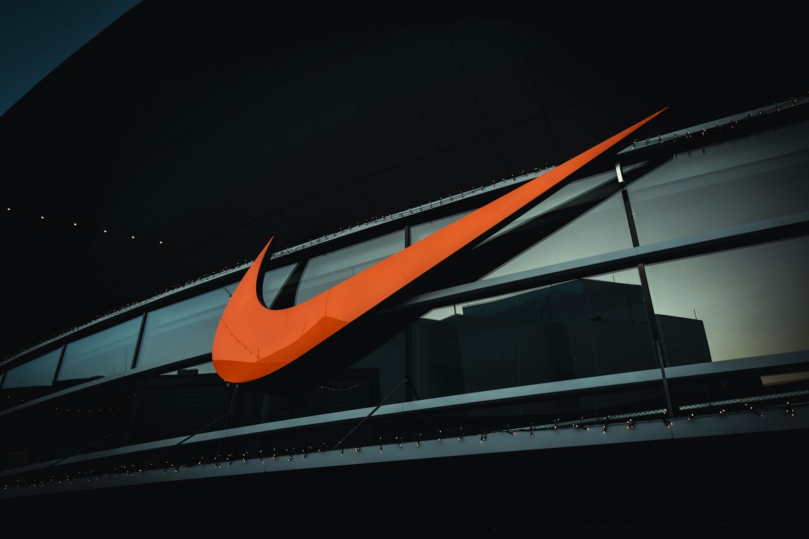
Five decades later, the same mark at architectural scale. Wolfsburg, Germany.
FedEx: The Arrow Few People Notice

Can you spot the hidden arrow? Look between the "E" and the "x".
In 1994, Landor Associates was hired to rebrand Federal Express. The name was shortened to FedEx, and senior design director Lindon Leader shaped an arrow into the negative space between the "E" and the "x", a quiet reference to speed and precision.
"The power of the hidden arrow is simply that it is a hidden bonus."
Lindon Leader, designer of the FedEx logo
According to Leader, missing the arrow does not weaken the logo. The promise of speed and reliability is kept by trucks, tracking and on-time deliveries. The arrow only echoes it.
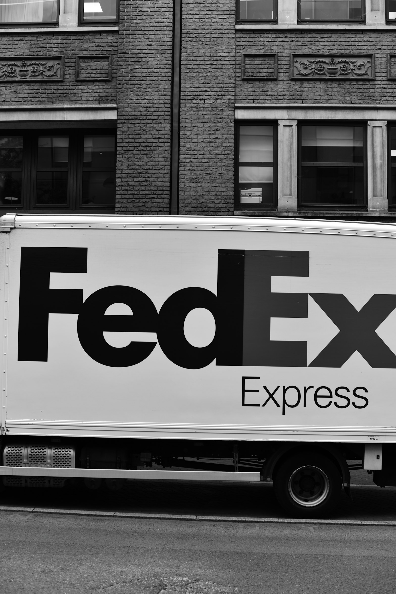
The arrow suggests speed. The fleet delivers it.
Gap: One Week in 2010

The blue box, unchanged for two decades before 2010.
On 6 October 2010, Gap replaced its blue box logo with a Helvetica wordmark and a small gradient square. Thousands of negative comments followed within days, along with a wave of parody logos. On 11 October, the blue box was back.

Launch, backlash and reversal in five days.
"All roads were leading us back to the blue box."
Marka Hansen, President, Gap North America
Customers had attached twenty years of memories to the old mark, and the change arrived with no story behind it. The episode showed where a brand actually resides: with its audience.
Where a Brand Is Built
}.oc{transform-box:fill-box;transform-origin:center}.ol{transform-box:fill-box;transform-origin:left center}@keyframes k0{0%25{opacity:0}6%25{opacity:0}8%25{opacity:1}92%25{opacity:1}98%25{opacity:0}100%25{opacity:0}}
.k0{animation-name:k0}@keyframes k1{0%25{opacity:0;transform:scale(.9)}6%25{opacity:0;transform:scale(.9)}8.5%25{opacity:1;transform:scale(1)}92%25{opacity:1;transform:scale(1)}98%25{opacity:0;transform:scale(1)}100%25{opacity:0;transform:scale(.9)}}
.k1{animation-name:k1}@keyframes k2{0%25{opacity:0;transform:translate(800px,300px)}6%25{opacity:0;transform:translate(800px,300px)}6.1%25{opacity:1;transform:translate(800px,300px)}11.5%25{opacity:1;transform:translate(800px,435px)}11.6%25{opacity:0;transform:translate(800px,435px)}100%25{opacity:0;transform:translate(800px,435px)}}
.k2{animation-name:k2}@keyframes k3{0%25{opacity:0}12%25{opacity:0}14%25{opacity:1}92%25{opacity:1}98%25{opacity:0}100%25{opacity:0}}
.k3{animation-name:k3}@keyframes k4{0%25{opacity:0;transform:scale(.9)}12%25{opacity:0;transform:scale(.9)}14.5%25{opacity:1;transform:scale(1)}92%25{opacity:1;transform:scale(1)}98%25{opacity:0;transform:scale(1)}100%25{opacity:0;transform:scale(.9)}}
.k4{animation-name:k4}@keyframes k5{0%25{opacity:0;transform:translate(990px,338.2px)}12%25{opacity:0;transform:translate(990px,338.2px)}12.1%25{opacity:1;transform:translate(990px,338.2px)}17.5%25{opacity:1;transform:translate(875px,455.1px)}17.6%25{opacity:0;transform:translate(875px,455.1px)}100%25{opacity:0;transform:translate(875px,455.1px)}}
.k5{animation-name:k5}@keyframes k6{0%25{opacity:0}18%25{opacity:0}20%25{opacity:1}92%25{opacity:1}98%25{opacity:0}100%25{opacity:0}}
.k6{animation-name:k6}@keyframes k7{0%25{opacity:0;transform:scale(.9)}18%25{opacity:0;transform:scale(.9)}20.5%25{opacity:1;transform:scale(1)}92%25{opacity:1;transform:scale(1)}98%25{opacity:0;transform:scale(1)}100%25{opacity:0;transform:scale(.9)}}
.k7{animation-name:k7}@keyframes k8{0%25{opacity:0;transform:translate(1129.1px,442.5px)}18%25{opacity:0;transform:translate(1129.1px,442.5px)}18.1%25{opacity:1;transform:translate(1129.1px,442.5px)}23.5%25{opacity:1;transform:translate(929.9px,510px)}23.6%25{opacity:0;transform:translate(929.9px,510px)}100%25{opacity:0;transform:translate(929.9px,510px)}}
.k8{animation-name:k8}@keyframes k9{0%25{opacity:0}24%25{opacity:0}26%25{opacity:1}92%25{opacity:1}98%25{opacity:0}100%25{opacity:0}}
.k9{animation-name:k9}@keyframes k10{0%25{opacity:0;transform:scale(.9)}24%25{opacity:0;transform:scale(.9)}26.5%25{opacity:1;transform:scale(1)}92%25{opacity:1;transform:scale(1)}98%25{opacity:0;transform:scale(1)}100%25{opacity:0;transform:scale(.9)}}
.k10{animation-name:k10}@keyframes k11{0%25{opacity:0;transform:translate(1180px,585px)}24%25{opacity:0;transform:translate(1180px,585px)}24.1%25{opacity:1;transform:translate(1180px,585px)}29.5%25{opacity:1;transform:translate(950px,585px)}29.6%25{opacity:0;transform:translate(950px,585px)}100%25{opacity:0;transform:translate(950px,585px)}}
.k11{animation-name:k11}@keyframes k12{0%25{opacity:0}30%25{opacity:0}32%25{opacity:1}92%25{opacity:1}98%25{opacity:0}100%25{opacity:0}}
.k12{animation-name:k12}@keyframes k13{0%25{opacity:0;transform:scale(.9)}30%25{opacity:0;transform:scale(.9)}32.5%25{opacity:1;transform:scale(1)}92%25{opacity:1;transform:scale(1)}98%25{opacity:0;transform:scale(1)}100%25{opacity:0;transform:scale(.9)}}
.k13{animation-name:k13}@keyframes k14{0%25{opacity:0;transform:translate(1129.1px,727.5px)}30%25{opacity:0;transform:translate(1129.1px,727.5px)}30.1%25{opacity:1;transform:translate(1129.1px,727.5px)}35.5%25{opacity:1;transform:translate(929.9px,660px)}35.6%25{opacity:0;transform:translate(929.9px,660px)}100%25{opacity:0;transform:translate(929.9px,660px)}}
.k14{animation-name:k14}@keyframes k15{0%25{opacity:0}36%25{opacity:0}38%25{opacity:1}92%25{opacity:1}98%25{opacity:0}100%25{opacity:0}}
.k15{animation-name:k15}@keyframes k16{0%25{opacity:0;transform:scale(.9)}36%25{opacity:0;transform:scale(.9)}38.5%25{opacity:1;transform:scale(1)}92%25{opacity:1;transform:scale(1)}98%25{opacity:0;transform:scale(1)}100%25{opacity:0;transform:scale(.9)}}
.k16{animation-name:k16}@keyframes k17{0%25{opacity:0;transform:translate(990px,831.8px)}36%25{opacity:0;transform:translate(990px,831.8px)}36.1%25{opacity:1;transform:translate(990px,831.8px)}41.5%25{opacity:1;transform:translate(875px,714.9px)}41.6%25{opacity:0;transform:translate(875px,714.9px)}100%25{opacity:0;transform:translate(875px,714.9px)}}
.k17{animation-name:k17}@keyframes k18{0%25{opacity:0}42%25{opacity:0}44%25{opacity:1}92%25{opacity:1}98%25{opacity:0}100%25{opacity:0}}
.k18{animation-name:k18}@keyframes k19{0%25{opacity:0;transform:scale(.9)}42%25{opacity:0;transform:scale(.9)}44.5%25{opacity:1;transform:scale(1)}92%25{opacity:1;transform:scale(1)}98%25{opacity:0;transform:scale(1)}100%25{opacity:0;transform:scale(.9)}}
.k19{animation-name:k19}@keyframes k20{0%25{opacity:0;transform:translate(800px,870px)}42%25{opacity:0;transform:translate(800px,870px)}42.1%25{opacity:1;transform:translate(800px,870px)}47.5%25{opacity:1;transform:translate(800px,735px)}47.6%25{opacity:0;transform:translate(800px,735px)}100%25{opacity:0;transform:translate(800px,735px)}}
.k20{animation-name:k20}@keyframes k21{0%25{opacity:0}48%25{opacity:0}50%25{opacity:1}92%25{opacity:1}98%25{opacity:0}100%25{opacity:0}}
.k21{animation-name:k21}@keyframes k22{0%25{opacity:0;transform:scale(.9)}48%25{opacity:0;transform:scale(.9)}50.5%25{opacity:1;transform:scale(1)}92%25{opacity:1;transform:scale(1)}98%25{opacity:0;transform:scale(1)}100%25{opacity:0;transform:scale(.9)}}
.k22{animation-name:k22}@keyframes k23{0%25{opacity:0;transform:translate(610px,831.8px)}48%25{opacity:0;transform:translate(610px,831.8px)}48.1%25{opacity:1;transform:translate(610px,831.8px)}53.5%25{opacity:1;transform:translate(725px,714.9px)}53.6%25{opacity:0;transform:translate(725px,714.9px)}100%25{opacity:0;transform:translate(725px,714.9px)}}
.k23{animation-name:k23}@keyframes k24{0%25{opacity:0}54%25{opacity:0}56%25{opacity:1}92%25{opacity:1}98%25{opacity:0}100%25{opacity:0}}
.k24{animation-name:k24}@keyframes k25{0%25{opacity:0;transform:scale(.9)}54%25{opacity:0;transform:scale(.9)}56.5%25{opacity:1;transform:scale(1)}92%25{opacity:1;transform:scale(1)}98%25{opacity:0;transform:scale(1)}100%25{opacity:0;transform:scale(.9)}}
.k25{animation-name:k25}@keyframes k26{0%25{opacity:0;transform:translate(470.9px,727.5px)}54%25{opacity:0;transform:translate(470.9px,727.5px)}54.1%25{opacity:1;transform:translate(470.9px,727.5px)}59.5%25{opacity:1;transform:translate(670.1px,660px)}59.6%25{opacity:0;transform:translate(670.1px,660px)}100%25{opacity:0;transform:translate(670.1px,660px)}}
.k26{animation-name:k26}@keyframes k27{0%25{opacity:0}60%25{opacity:0}62%25{opacity:1}92%25{opacity:1}98%25{opacity:0}100%25{opacity:0}}
.k27{animation-name:k27}@keyframes k28{0%25{opacity:0;transform:scale(.9)}60%25{opacity:0;transform:scale(.9)}62.5%25{opacity:1;transform:scale(1)}92%25{opacity:1;transform:scale(1)}98%25{opacity:0;transform:scale(1)}100%25{opacity:0;transform:scale(.9)}}
.k28{animation-name:k28}@keyframes k29{0%25{opacity:0;transform:translate(420px,585px)}60%25{opacity:0;transform:translate(420px,585px)}60.1%25{opacity:1;transform:translate(420px,585px)}65.5%25{opacity:1;transform:translate(650px,585px)}65.6%25{opacity:0;transform:translate(650px,585px)}100%25{opacity:0;transform:translate(650px,585px)}}
.k29{animation-name:k29}@keyframes k30{0%25{opacity:0}66%25{opacity:0}68%25{opacity:1}92%25{opacity:1}98%25{opacity:0}100%25{opacity:0}}
.k30{animation-name:k30}@keyframes k31{0%25{opacity:0;transform:scale(.9)}66%25{opacity:0;transform:scale(.9)}68.5%25{opacity:1;transform:scale(1)}92%25{opacity:1;transform:scale(1)}98%25{opacity:0;transform:scale(1)}100%25{opacity:0;transform:scale(.9)}}
.k31{animation-name:k31}@keyframes k32{0%25{opacity:0;transform:translate(470.9px,442.5px)}66%25{opacity:0;transform:translate(470.9px,442.5px)}66.1%25{opacity:1;transform:translate(470.9px,442.5px)}71.5%25{opacity:1;transform:translate(670.1px,510px)}71.6%25{opacity:0;transform:translate(670.1px,510px)}100%25{opacity:0;transform:translate(670.1px,510px)}}
.k32{animation-name:k32}@keyframes k33{0%25{opacity:0}72%25{opacity:0}74%25{opacity:1}92%25{opacity:1}98%25{opacity:0}100%25{opacity:0}}
.k33{animation-name:k33}@keyframes k34{0%25{opacity:0;transform:scale(.9)}72%25{opacity:0;transform:scale(.9)}74.5%25{opacity:1;transform:scale(1)}92%25{opacity:1;transform:scale(1)}98%25{opacity:0;transform:scale(1)}100%25{opacity:0;transform:scale(.9)}}
.k34{animation-name:k34}@keyframes k35{0%25{opacity:0;transform:translate(610px,338.2px)}72%25{opacity:0;transform:translate(610px,338.2px)}72.1%25{opacity:1;transform:translate(610px,338.2px)}77.5%25{opacity:1;transform:translate(725px,455.1px)}77.6%25{opacity:0;transform:translate(725px,455.1px)}100%25{opacity:0;transform:translate(725px,455.1px)}}
.k35{animation-name:k35}@keyframes k36{0%25{stroke-dashoffset:942.5;opacity:1}11.5%25{stroke-dashoffset:863.9;opacity:1}17.5%25{stroke-dashoffset:785.4;opacity:1}23.5%25{stroke-dashoffset:706.9;opacity:1}29.5%25{stroke-dashoffset:628.3;opacity:1}35.5%25{stroke-dashoffset:549.8;opacity:1}41.5%25{stroke-dashoffset:471.2;opacity:1}47.5%25{stroke-dashoffset:392.7;opacity:1}53.5%25{stroke-dashoffset:314.2;opacity:1}59.5%25{stroke-dashoffset:235.6;opacity:1}65.5%25{stroke-dashoffset:157.1;opacity:1}71.5%25{stroke-dashoffset:78.5;opacity:1}77.5%25{stroke-dashoffset:0;opacity:1}92%25{stroke-dashoffset:0;opacity:1}98%25{stroke-dashoffset:0;opacity:0}100%25{stroke-dashoffset:942.5;opacity:0}}
.k36{animation-name:k36}</style>
<rect width='1600' height='1000' fill='%23ffffff'/>
<text x='800' y='95' text-anchor='middle' class='h' font-size='48' fill='%230f1720'>One Logo, Many Touchpoints</text>
<text x='800' y='145' text-anchor='middle' font-size='27' fill='%234a5568'>Each interaction adds to the brand, or takes from it</text>
<ellipse cx='800' cy='585' rx='470' ry='330' fill='none' stroke='%23d6e0ef' stroke-width='2' stroke-dasharray='6 10'/>
<g id='lines'>
<line x1='800' y1='435' x2='800' y2='300' stroke='%23c9d7ee' stroke-width='2'/>
<line x1='875' y1='455' x2='990' y2='338.1' stroke='%23c9d7ee' stroke-width='2'/>
<line x1='929.9' y1='510' x2='1129' y2='442.5' stroke='%23c9d7ee' stroke-width='2'/>
<line x1='950' y1='585' x2='1180' y2='585' stroke='%23c9d7ee' stroke-width='2'/>
<line x1='929.9' y1='660' x2='1129' y2='727.5' stroke='%23c9d7ee' stroke-width='2'/>
<line x1='875' y1='714.9' x2='990' y2='831.8' stroke='%23c9d7ee' stroke-width='2'/>
<line x1='800' y1='735' x2='800' y2='870' stroke='%23c9d7ee' stroke-width='2'/>
<line x1='725' y1='714.9' x2='610' y2='831.8' stroke='%23c9d7ee' stroke-width='2'/>
<line x1='670' y1='660' x2='470.9' y2='727.5' stroke='%23c9d7ee' stroke-width='2'/>
<line x1='650' y1='585' x2='420' y2='585' stroke='%23c9d7ee' stroke-width='2'/>
<line x1='670' y1='510' x2='470.9' y2='442.5' stroke='%23c9d7ee' stroke-width='2'/>
<line x1='724.9' y1='455' x2='609.9' y2='338.1' stroke='%23c9d7ee' stroke-width='2'/>
</g>
<g id='hlines'>
<line x1='800' y1='435' x2='800' y2='300' stroke='%23ffb48f' stroke-width='3' class='k0'/>
<line x1='875' y1='455' x2='990' y2='338.1' stroke='%23ffb48f' stroke-width='3' class='k3'/>
<line x1='929.9' y1='510' x2='1129' y2='442.5' stroke='%23ffb48f' stroke-width='3' class='k6'/>
<line x1='950' y1='585' x2='1180' y2='585' stroke='%23ffb48f' stroke-width='3' class='k9'/>
<line x1='929.9' y1='660' x2='1129' y2='727.5' stroke='%23ffb48f' stroke-width='3' class='k12'/>
<line x1='875' y1='714.9' x2='990' y2='831.8' stroke='%23ffb48f' stroke-width='3' class='k15'/>
<line x1='800' y1='735' x2='800' y2='870' stroke='%23ffb48f' stroke-width='3' class='k18'/>
<line x1='725' y1='714.9' x2='610' y2='831.8' stroke='%23ffb48f' stroke-width='3' class='k21'/>
<line x1='670' y1='660' x2='470.9' y2='727.5' stroke='%23ffb48f' stroke-width='3' class='k24'/>
<line x1='650' y1='585' x2='420' y2='585' stroke='%23ffb48f' stroke-width='3' class='k27'/>
<line x1='670' y1='510' x2='470.9' y2='442.5' stroke='%23ffb48f' stroke-width='3' class='k30'/>
<line x1='724.9' y1='455' x2='609.9' y2='338.1' stroke='%23ffb48f' stroke-width='3' class='k33'/>
</g>
<circle cx='800' cy='585' r='150' fill='none' stroke='%23e3ebf7' stroke-width='12'/>
<circle id='arc' cx='800' cy='585' r='150' fill='none' stroke='%23ff5000' stroke-width='12' stroke-linecap='round' transform='rotate(-90 800 585)' stroke-dasharray='942.5' class='k36'/>
<circle cx='800' cy='585' r='130' fill='%23015bd3'/>
<text x='800' y='577' text-anchor='middle' class='h' font-size='34' fill='%23ffffff'>BRAND</text>
<text x='800' y='619' text-anchor='middle' font-size='24' fill='%23cfe0fa'>perception</text>
<g id='dots'>
<circle cx='0' cy='0' r='9' fill='%23ff5000' class='k2'/>
<circle cx='0' cy='0' r='9' fill='%23ff5000' class='k5'/>
<circle cx='0' cy='0' r='9' fill='%23ff5000' class='k8'/>
<circle cx='0' cy='0' r='9' fill='%23ff5000' class='k11'/>
<circle cx='0' cy='0' r='9' fill='%23ff5000' class='k14'/>
<circle cx='0' cy='0' r='9' fill='%23ff5000' class='k17'/>
<circle cx='0' cy='0' r='9' fill='%23ff5000' class='k20'/>
<circle cx='0' cy='0' r='9' fill='%23ff5000' class='k23'/>
<circle cx='0' cy='0' r='9' fill='%23ff5000' class='k26'/>
<circle cx='0' cy='0' r='9' fill='%23ff5000' class='k29'/>
<circle cx='0' cy='0' r='9' fill='%23ff5000' class='k32'/>
<circle cx='0' cy='0' r='9' fill='%23ff5000' class='k35'/>
</g>
<g id='nodes' font-size='25' font-weight='600' text-anchor='middle'>
<rect x='744' y='225' width='112' height='60' rx='30' fill='%23f4f7fc' stroke='%23c9d7ee' stroke-width='2'/>
<text x='800' y='264' fill='%230f1720'>Logo</text>
<rect x='958' y='269.2' width='154' height='60' rx='30' fill='%23f4f7fc' stroke='%23c9d7ee' stroke-width='2'/>
<text x='1035' y='308.2' fill='%230f1720'>Product</text>
<rect x='1116' y='390' width='182' height='60' rx='30' fill='%23f4f7fc' stroke='%23c9d7ee' stroke-width='2'/>
<text x='1207' y='429' fill='%230f1720'>Packaging</text>
<rect x='1193' y='555' width='154' height='60' rx='30' fill='%23f4f7fc' stroke='%23c9d7ee' stroke-width='2'/>
<text x='1270' y='594' fill='%230f1720'>Website</text>
<rect x='1095' y='720' width='224' height='60' rx='30' fill='%23f4f7fc' stroke='%23c9d7ee' stroke-width='2'/>
<text x='1207' y='759' fill='%230f1720'>Social media</text>
<rect x='895' y='840.7' width='280' height='60' rx='30' fill='%23f4f7fc' stroke='%23c9d7ee' stroke-width='2'/>
<text x='1035' y='879.7' fill='%230f1720'>Customer service</text>
<rect x='737' y='885' width='126' height='60' rx='30' fill='%23f4f7fc' stroke='%23c9d7ee' stroke-width='2'/>
<text x='800' y='924' fill='%230f1720'>Staff</text>
<rect x='488' y='840.7' width='154' height='60' rx='30' fill='%23f4f7fc' stroke='%23c9d7ee' stroke-width='2'/>
<text x='565' y='879.7' fill='%230f1720'>Pricing</text>
<rect x='273.9' y='720' width='238' height='60' rx='30' fill='%23f4f7fc' stroke='%23c9d7ee' stroke-width='2'/>
<text x='392.9' y='759' fill='%230f1720'>Tone of voice</text>
<rect x='260' y='555' width='140' height='60' rx='30' fill='%23f4f7fc' stroke='%23c9d7ee' stroke-width='2'/>
<text x='330' y='594' fill='%230f1720'>Spaces</text>
<rect x='308.9' y='390' width='168' height='60' rx='30' fill='%23f4f7fc' stroke='%23c9d7ee' stroke-width='2'/>
<text x='392.9' y='429' fill='%230f1720'>Delivery</text>
<rect x='445.9' y='269.2' width='238' height='60' rx='30' fill='%23f4f7fc' stroke='%23c9d7ee' stroke-width='2'/>
<text x='564.9' y='308.2' fill='%230f1720'>Word of mouth</text>
</g>
<g id='hnodes' font-size='25' font-weight='600' text-anchor='middle'>
<g class='k1 oc'>
<rect x='744' y='225' width='112' height='60' rx='30' fill='%23ff5000'/>
<text x='800' y='264' fill='%23ffffff'>Logo</text>
</g>
<g class='k4 oc'>
<rect x='958' y='269.2' width='154' height='60' rx='30' fill='%23ff5000'/>
<text x='1035' y='308.2' fill='%23ffffff'>Product</text>
</g>
<g class='k7 oc'>
<rect x='1116' y='390' width='182' height='60' rx='30' fill='%23ff5000'/>
<text x='1207' y='429' fill='%23ffffff'>Packaging</text>
</g>
<g class='k10 oc'>
<rect x='1193' y='555' width='154' height='60' rx='30' fill='%23ff5000'/>
<text x='1270' y='594' fill='%23ffffff'>Website</text>
</g>
<g class='k13 oc'>
<rect x='1095' y='720' width='224' height='60' rx='30' fill='%23ff5000'/>
<text x='1207' y='759' fill='%23ffffff'>Social media</text>
</g>
<g class='k16 oc'>
<rect x='895' y='840.7' width='280' height='60' rx='30' fill='%23ff5000'/>
<text x='1035' y='879.7' fill='%23ffffff'>Customer service</text>
</g>
<g class='k19 oc'>
<rect x='737' y='885' width='126' height='60' rx='30' fill='%23ff5000'/>
<text x='800' y='924' fill='%23ffffff'>Staff</text>
</g>
<g class='k22 oc'>
<rect x='488' y='840.7' width='154' height='60' rx='30' fill='%23ff5000'/>
<text x='565' y='879.7' fill='%23ffffff'>Pricing</text>
</g>
<g class='k25 oc'>
<rect x='273.9' y='720' width='238' height='60' rx='30' fill='%23ff5000'/>
<text x='392.9' y='759' fill='%23ffffff'>Tone of voice</text>
</g>
<g class='k28 oc'>
<rect x='260' y='555' width='140' height='60' rx='30' fill='%23ff5000'/>
<text x='330' y='594' fill='%23ffffff'>Spaces</text>
</g>
<g class='k31 oc'>
<rect x='308.9' y='390' width='168' height='60' rx='30' fill='%23ff5000'/>
<text x='392.9' y='429' fill='%23ffffff'>Delivery</text>
</g>
<g class='k34 oc'>
<rect x='445.9' y='269.2' width='238' height='60' rx='30' fill='%23ff5000'/>
<text x='564.9' y='308.2' fill='%23ffffff'>Word of mouth</text>
</g>
</g>
</svg>)
Every touchpoint feeds the same perception. The logo is one of twelve.
Every touchpoint sends a signal: how a phone is answered, how fast a message is returned, how a package is sealed, how a caption is written. A strong logo amplifies a consistent experience. It cannot repair an inconsistent one.
}.oc{transform-box:fill-box;transform-origin:center}.ol{transform-box:fill-box;transform-origin:left center}@keyframes k0{0%25{opacity:0;transform:scale(.85)}6%25{opacity:0;transform:scale(.85)}10.5%25{opacity:1;transform:scale(1)}92%25{opacity:1;transform:scale(1)}98%25{opacity:0;transform:scale(1)}100%25{opacity:0;transform:scale(.85)}}
.k0{animation-name:k0}@keyframes k1{0%25{opacity:0;transform:scale(.85)}17%25{opacity:0;transform:scale(.85)}21.5%25{opacity:1;transform:scale(1)}92%25{opacity:1;transform:scale(1)}98%25{opacity:0;transform:scale(1)}100%25{opacity:0;transform:scale(.85)}}
.k1{animation-name:k1}@keyframes k2{0%25{opacity:0;transform:scale(.85)}28%25{opacity:0;transform:scale(.85)}32.5%25{opacity:1;transform:scale(1)}92%25{opacity:1;transform:scale(1)}98%25{opacity:0;transform:scale(1)}100%25{opacity:0;transform:scale(.85)}}
.k2{animation-name:k2}@keyframes k3{0%25{opacity:0;transform:scale(.85)}39%25{opacity:0;transform:scale(.85)}43.5%25{opacity:1;transform:scale(1)}92%25{opacity:1;transform:scale(1)}98%25{opacity:0;transform:scale(1)}100%25{opacity:0;transform:scale(.85)}}
.k3{animation-name:k3}@keyframes k4{0%25{opacity:0;transform:scale(.85)}50%25{opacity:0;transform:scale(.85)}54.5%25{opacity:1;transform:scale(1)}92%25{opacity:1;transform:scale(1)}98%25{opacity:0;transform:scale(1)}100%25{opacity:0;transform:scale(.85)}}
.k4{animation-name:k4}@keyframes k5{0%25{opacity:0;transform:scale(.85)}6%25{opacity:0;transform:scale(.85)}10.5%25{opacity:1;transform:scale(1)}92%25{opacity:1;transform:scale(1)}98%25{opacity:0;transform:scale(1)}100%25{opacity:0;transform:scale(.85)}}
.k5{animation-name:k5}@keyframes k6{0%25{opacity:0;transform:scale(.85)}17%25{opacity:0;transform:scale(.85)}21.5%25{opacity:1;transform:scale(1)}92%25{opacity:1;transform:scale(1)}98%25{opacity:0;transform:scale(1)}100%25{opacity:0;transform:scale(.85)}}
.k6{animation-name:k6}@keyframes k7{0%25{opacity:0;transform:scale(.85)}28%25{opacity:0;transform:scale(.85)}32.5%25{opacity:1;transform:scale(1)}92%25{opacity:1;transform:scale(1)}98%25{opacity:0;transform:scale(1)}100%25{opacity:0;transform:scale(.85)}}
.k7{animation-name:k7}@keyframes k8{0%25{opacity:0;transform:scale(.85)}39%25{opacity:0;transform:scale(.85)}43.5%25{opacity:1;transform:scale(1)}92%25{opacity:1;transform:scale(1)}98%25{opacity:0;transform:scale(1)}100%25{opacity:0;transform:scale(.85)}}
.k8{animation-name:k8}@keyframes k9{0%25{opacity:0;transform:scale(.85)}50%25{opacity:0;transform:scale(.85)}54.5%25{opacity:1;transform:scale(1)}92%25{opacity:1;transform:scale(1)}98%25{opacity:0;transform:scale(1)}100%25{opacity:0;transform:scale(.85)}}
.k9{animation-name:k9}@keyframes k10{0%25{transform:scaleX(0);opacity:1}8%25{transform:scaleX(0);opacity:1}14%25{transform:scaleX(0.1);opacity:1}25%25{transform:scaleX(0.3);opacity:1}36%25{transform:scaleX(0.5);opacity:1}47%25{transform:scaleX(0.7);opacity:1}58%25{transform:scaleX(0.9);opacity:1}92%25{transform:scaleX(.92);opacity:1}98%25{transform:scaleX(.92);opacity:0}100%25{transform:scaleX(0);opacity:0}}
.k10{animation-name:k10}@keyframes k11{0%25{transform:scaleX(0);opacity:1}8%25{transform:scaleX(0);opacity:1}14%25{transform:scaleX(0.2);opacity:1}25%25{transform:scaleX(0.1);opacity:1}36%25{transform:scaleX(0.2);opacity:1}47%25{transform:scaleX(0.1);opacity:1}58%25{transform:scaleX(0.2);opacity:1}92%25{transform:scaleX(.21);opacity:1}98%25{transform:scaleX(.21);opacity:0}100%25{transform:scaleX(0);opacity:0}}
.k11{animation-name:k11}@keyframes k12{0%25{opacity:0}62%25{opacity:0}68%25{opacity:1}92%25{opacity:1}98%25{opacity:0}100%25{opacity:0}}
.k12{animation-name:k12}@keyframes k13{0%25{opacity:0}62%25{opacity:0}68%25{opacity:1}92%25{opacity:1}98%25{opacity:0}100%25{opacity:0}}
.k13{animation-name:k13}</style>
<rect width='1600' height='1000' fill='%23f4f7fc'/>
<rect x='50' y='50' width='730' height='900' rx='28' fill='%23ffffff' stroke='%23d6e0ef' stroke-width='2'/>
<rect x='820' y='50' width='730' height='900' rx='28' fill='%23ffffff' stroke='%23d6e0ef' stroke-width='2'/>
<text x='415' y='130' text-anchor='middle' class='h' font-size='38' fill='%23015bd3'>Consistent</text>
<text x='1185' y='130' text-anchor='middle' class='h' font-size='38' fill='%230f1720'>Inconsistent</text>
<text x='415' y='172' text-anchor='middle' font-size='24' fill='%236b7a90'>Same logo, same system everywhere</text>
<text x='1185' y='172' text-anchor='middle' font-size='24' fill='%236b7a90'>Same logo, a different look every time</text>
<g id='L'>
<g class='k0 oc'>
<rect x='93' y='225' width='196' height='190' rx='16' fill='%23ffffff' stroke='%23d6e0ef' stroke-width='2'/>
<rect x='93' y='225' width='196' height='34' rx='16' fill='%23015bd3'/>
<rect x='93' y='243' width='196' height='16' fill='%23015bd3'/>
<g transform='rotate(0 191 330)'>
<circle cx='149' cy='330' r='20' fill='none' stroke='%23015bd3' stroke-width='7'/>
<circle cx='163' cy='315' r='6' fill='%23ff5000'/>
<text x='179' y='341' font-size='30' font-weight='700' fill='%230f1720' data-font='h' class='h'>nova</text>
</g>
<rect x='117' y='371' width='148' height='8' rx='4' fill='%23e3ebf7'/>
<text x='191' y='449' text-anchor='middle' font-size='21' fill='%234a5568'>Website</text>
</g>
<g class='k1 oc'>
<rect x='317' y='225' width='196' height='190' rx='16' fill='%23ffffff' stroke='%23d6e0ef' stroke-width='2'/>
<rect x='317' y='225' width='196' height='34' rx='16' fill='%23015bd3'/>
<rect x='317' y='243' width='196' height='16' fill='%23015bd3'/>
<g transform='rotate(0 415 330)'>
<circle cx='373' cy='330' r='20' fill='none' stroke='%23015bd3' stroke-width='7'/>
<circle cx='387' cy='315' r='6' fill='%23ff5000'/>
<text x='403' y='341' font-size='30' font-weight='700' fill='%230f1720' data-font='h' class='h'>nova</text>
</g>
<rect x='341' y='371' width='148' height='8' rx='4' fill='%23e3ebf7'/>
<text x='415' y='449' text-anchor='middle' font-size='21' fill='%234a5568'>Business card</text>
</g>
<g class='k2 oc'>
<rect x='541' y='225' width='196' height='190' rx='16' fill='%23ffffff' stroke='%23d6e0ef' stroke-width='2'/>
<rect x='541' y='225' width='196' height='34' rx='16' fill='%23015bd3'/>
<rect x='541' y='243' width='196' height='16' fill='%23015bd3'/>
<g transform='rotate(0 639 330)'>
<circle cx='597' cy='330' r='20' fill='none' stroke='%23015bd3' stroke-width='7'/>
<circle cx='611' cy='315' r='6' fill='%23ff5000'/>
<text x='627' y='341' font-size='30' font-weight='700' fill='%230f1720' data-font='h' class='h'>nova</text>
</g>
<rect x='565' y='371' width='148' height='8' rx='4' fill='%23e3ebf7'/>
<text x='639' y='449' text-anchor='middle' font-size='21' fill='%234a5568'>Social post</text>
</g>
<g class='k3 oc'>
<rect x='205' y='485' width='196' height='190' rx='16' fill='%23ffffff' stroke='%23d6e0ef' stroke-width='2'/>
<rect x='205' y='485' width='196' height='34' rx='16' fill='%23015bd3'/>
<rect x='205' y='503' width='196' height='16' fill='%23015bd3'/>
<g transform='rotate(0 303 590)'>
<circle cx='261' cy='590' r='20' fill='none' stroke='%23015bd3' stroke-width='7'/>
<circle cx='275' cy='575' r='6' fill='%23ff5000'/>
<text x='291' y='601' font-size='30' font-weight='700' fill='%230f1720' data-font='h' class='h'>nova</text>
</g>
<rect x='229' y='631' width='148' height='8' rx='4' fill='%23e3ebf7'/>
<text x='303' y='709' text-anchor='middle' font-size='21' fill='%234a5568'>Packaging</text>
</g>
<g class='k4 oc'>
<rect x='429' y='485' width='196' height='190' rx='16' fill='%23ffffff' stroke='%23d6e0ef' stroke-width='2'/>
<rect x='429' y='485' width='196' height='34' rx='16' fill='%23015bd3'/>
<rect x='429' y='503' width='196' height='16' fill='%23015bd3'/>
<g transform='rotate(0 527 590)'>
<circle cx='485' cy='590' r='20' fill='none' stroke='%23015bd3' stroke-width='7'/>
<circle cx='499' cy='575' r='6' fill='%23ff5000'/>
<text x='515' y='601' font-size='30' font-weight='700' fill='%230f1720' data-font='h' class='h'>nova</text>
</g>
<rect x='453' y='631' width='148' height='8' rx='4' fill='%23e3ebf7'/>
<text x='527' y='709' text-anchor='middle' font-size='21' fill='%234a5568'>Signage</text>
</g>
</g>
<g id='R'>
<g class='k5 oc'>
<rect x='863' y='225' width='196' height='190' rx='16' fill='%23ffffff' stroke='%23d6e0ef' stroke-width='2'/>
<rect x='863' y='225' width='196' height='34' rx='16' fill='%232f855a'/>
<rect x='863' y='243' width='196' height='16' fill='%232f855a'/>
<g transform='rotate(0 961 330)'>
<circle cx='919' cy='330' r='20' fill='none' stroke='%232f855a' stroke-width='7'/>
<circle cx='933' cy='315' r='6' fill='%23d69e2e'/>
<text x='949' y='341' font-size='30' font-weight='700' fill='%232d3748' data-font='serif'>Nova</text>
</g>
<rect x='887' y='371' width='148' height='8' rx='4' fill='%23e3ebf7'/>
<text x='961' y='449' text-anchor='middle' font-size='21' fill='%234a5568'>Website</text>
</g>
<g class='k6 oc'>
<rect x='1087' y='225' width='196' height='190' rx='16' fill='%23fffbea' stroke='%23d6e0ef' stroke-width='2'/>
<rect x='1087' y='225' width='196' height='34' rx='16' fill='%23805ad5'/>
<rect x='1087' y='243' width='196' height='16' fill='%23805ad5'/>
<g transform='rotate(-8 1185 330)'>
<circle cx='1143' cy='330' r='20' fill='none' stroke='%23805ad5' stroke-width='7'/>
<circle cx='1157' cy='315' r='6' fill='%23e53e3e'/>
<text x='1173' y='341' font-size='30' font-weight='700' fill='%23553c9a' data-font='mono'>NOVA</text>
</g>
<rect x='1111' y='371' width='148' height='8' rx='4' fill='%23e3ebf7'/>
<text x='1185' y='449' text-anchor='middle' font-size='21' fill='%234a5568'>Business card</text>
</g>
<g class='k7 oc'>
<rect x='1311' y='225' width='196' height='190' rx='16' fill='%23ffffff' stroke='%23d6e0ef' stroke-width='2'/>
<rect x='1311' y='225' width='196' height='34' rx='16' fill='%23e53e3e'/>
<rect x='1311' y='243' width='196' height='16' fill='%23e53e3e'/>
<g transform='rotate(12 1409 330)'>
<circle cx='1367' cy='330' r='20' fill='none' stroke='%23e53e3e' stroke-width='7'/>
<circle cx='1381' cy='315' r='6' fill='%23015bd3'/>
<text x='1397' y='341' font-size='30' font-weight='700' fill='%23c53030' data-font=''>Nova Co.</text>
</g>
<rect x='1335' y='371' width='148' height='8' rx='4' fill='%23e3ebf7'/>
<text x='1409' y='449' text-anchor='middle' font-size='21' fill='%234a5568'>Social post</text>
</g>
<g class='k8 oc'>
<rect x='975' y='485' width='196' height='190' rx='16' fill='%23f7fafc' stroke='%23d6e0ef' stroke-width='2'/>
<rect x='975' y='485' width='196' height='34' rx='16' fill='%23d69e2e'/>
<rect x='975' y='503' width='196' height='16' fill='%23d69e2e'/>
<g transform='rotate(0 1073 590)'>
<circle cx='1031' cy='590' r='20' fill='none' stroke='%23d69e2e' stroke-width='7'/>
<circle cx='1045' cy='575' r='6' fill='%232f855a'/>
<text x='1061' y='601' font-size='30' font-weight='700' fill='%23744210' data-font='serif'>nOva</text>
</g>
<rect x='999' y='631' width='148' height='8' rx='4' fill='%23e3ebf7'/>
<text x='1073' y='709' text-anchor='middle' font-size='21' fill='%234a5568'>Packaging</text>
</g>
<g class='k9 oc'>
<rect x='1199' y='485' width='196' height='190' rx='16' fill='%23ffffff' stroke='%23d6e0ef' stroke-width='2'/>
<rect x='1199' y='485' width='196' height='34' rx='16' fill='%23319795'/>
<rect x='1199' y='503' width='196' height='16' fill='%23319795'/>
<g transform='rotate(-4 1297 590)'>
<circle cx='1255' cy='590' r='20' fill='none' stroke='%23319795' stroke-width='7'/>
<circle cx='1269' cy='575' r='6' fill='%23805ad5'/>
<text x='1285' y='601' font-size='30' font-weight='700' fill='%23234e52' data-font='h' class='h'>NOVA!</text>
</g>
<rect x='1223' y='631' width='148' height='8' rx='4' fill='%23e3ebf7'/>
<text x='1297' y='709' text-anchor='middle' font-size='21' fill='%234a5568'>Signage</text>
</g>
</g>
<text x='120' y='810' font-size='22' letter-spacing='3' fill='%234a5568'>RECOGNITION AND TRUST</text>
<text x='890' y='810' font-size='22' letter-spacing='3' fill='%234a5568'>RECOGNITION AND TRUST</text>
<rect x='120' y='835' width='590' height='26' rx='13' fill='%23e3ebf7'/>
<rect x='890' y='835' width='590' height='26' rx='13' fill='%23e3ebf7'/>
<rect id='mL' x='120' y='835' width='590' height='26' rx='13' fill='%23015bd3' class='k10 ol'/>
<rect id='mR' x='890' y='835' width='590' height='26' rx='13' fill='%239aa6b8' class='k11 ol'/>
<text id='vL' x='710' y='905' text-anchor='end' class='h k12' font-size='30' fill='%23015bd3'>Builds with every touchpoint</text>
<text id='vR' x='1480' y='905' text-anchor='end' class='h k13' font-size='30' fill='%236b7a90'>Resets with every touchpoint</text>
</svg>)
The same logo, applied with and without a system.
How a Brand Identity Is Built
A professional identity project follows a sequence. Research and strategy come first, so every design decision has a reason behind it.
'>
<circle cx='-6' cy='-6' r='20' fill='none' stroke='%23fff' stroke-width='6'/>
<line x1='9' y1='9' x2='24' y2='24' stroke='%23fff' stroke-width='7' stroke-linecap='round'/>
</g>
<rect x='65' y='320' width='262' height='560' rx='22' fill='%23fff' stroke='%23d6e0ef' stroke-width='2'/>
<text x='93' y='380' class='h' font-size='22' fill='%23015bd3' letter-spacing='2'>STEP 01</text>
<text x='93' y='430' class='h' font-size='36' fill='%230f1720'>Discover</text>
<text x='93' y='478' font-size='23' fill='%234a5568'>Business, market</text>
<text x='93' y='510' font-size='23' fill='%234a5568'>and audience</text>
<text x='93' y='542' font-size='23' fill='%234a5568'>research</text>
<line x1='93' y1='590' x2='299' y2='590' stroke='%23e3ebf7' stroke-width='2'/>
<text x='93' y='630' font-size='18' letter-spacing='2' fill='%236b7a90'>DELIVERABLES</text>
<circle cx='99' cy='674' r='6' fill='%23015bd3'/>
<text x='115' y='681' font-size='19' font-weight='600' fill='%230f1720'>Stakeholder input</text>
<circle cx='99' cy='726' r='6' fill='%23015bd3'/>
<text x='115' y='733' font-size='19' font-weight='600' fill='%230f1720'>Audience insights</text>
<circle cx='99' cy='778' r='6' fill='%23015bd3'/>
<text x='115' y='785' font-size='19' font-weight='600' fill='%230f1720'>Competitor audit</text>
</g>
<g>
<circle cx='498' cy='235' r='52' fill='%23015bd3'/>
<g transform='translate(498 235)'>
<circle r='26' fill='none' stroke='%23fff' stroke-width='5'/>
<circle r='14' fill='none' stroke='%23fff' stroke-width='5'/>
<circle r='4' fill='%23fff'/>
</g>
<rect x='367' y='320' width='262' height='560' rx='22' fill='%23fff' stroke='%23d6e0ef' stroke-width='2'/>
<text x='395' y='380' class='h' font-size='22' fill='%23015bd3' letter-spacing='2'>STEP 02</text>
<text x='395' y='430' class='h' font-size='36' fill='%230f1720'>Define</text>
<text x='395' y='478' font-size='23' fill='%234a5568'>Strategy that</text>
<text x='395' y='510' font-size='23' fill='%234a5568'>guides every</text>
<text x='395' y='542' font-size='23' fill='%234a5568'>decision</text>
<line x1='395' y1='590' x2='601' y2='590' stroke='%23e3ebf7' stroke-width='2'/>
<text x='395' y='630' font-size='18' letter-spacing='2' fill='%236b7a90'>DELIVERABLES</text>
<circle cx='401' cy='674' r='6' fill='%23015bd3'/>
<text x='417' y='681' font-size='19' font-weight='600' fill='%230f1720'>Positioning</text>
<circle cx='401' cy='726' r='6' fill='%23015bd3'/>
<text x='417' y='733' font-size='19' font-weight='600' fill='%230f1720'>Values and character</text>
<circle cx='401' cy='778' r='6' fill='%23015bd3'/>
<text x='417' y='785' font-size='19' font-weight='600' fill='%230f1720'>Messaging and tone</text>
</g>
<g>
<circle cx='800' cy='235' r='52' fill='%23ff5000'/>
<g transform='translate(800 235)'>
<path d='M-22 22 L-14 -2 L8 -24 L24 -8 L2 14 Z' fill='none' stroke='%23fff' stroke-width='5' stroke-linejoin='round'/>
<line x1='-22' y1='22' x2='-8' y2='8' stroke='%23fff' stroke-width='5'/>
</g>
<rect x='669' y='320' width='262' height='560' rx='22' fill='%23fff' stroke='%23ff5000' stroke-width='4'/>
<text x='697' y='380' class='h' font-size='22' fill='%23ff5000' letter-spacing='2'>STEP 03</text>
<text x='697' y='430' class='h' font-size='36' fill='%230f1720'>Design</text>
<text x='697' y='478' font-size='23' fill='%234a5568'>The visual</text>
<text x='697' y='510' font-size='23' fill='%234a5568'>identity takes</text>
<text x='697' y='542' font-size='23' fill='%234a5568'>shape</text>
<line x1='697' y1='590' x2='903' y2='590' stroke='%23e3ebf7' stroke-width='2'/>
<text x='697' y='630' font-size='18' letter-spacing='2' fill='%236b7a90'>DELIVERABLES</text>
<circle cx='703' cy='674' r='6' fill='%23ff5000'/>
<text x='719' y='681' font-size='19' font-weight='600' fill='%230f1720'>Logo system</text>
<circle cx='703' cy='726' r='6' fill='%23ff5000'/>
<text x='719' y='733' font-size='19' font-weight='600' fill='%230f1720'>Colour and type</text>
<circle cx='703' cy='778' r='6' fill='%23ff5000'/>
<text x='719' y='785' font-size='19' font-weight='600' fill='%230f1720'>Imagery and graphics</text>
<rect x='650' y='902' width='300' height='50' rx='25' fill='%23ff5000'/>
<text x='800' y='933' text-anchor='middle' font-size='22' font-weight='700' fill='%23fff'>The logo appears here</text>
</g>
<g>
<circle cx='1102' cy='235' r='52' fill='%23015bd3'/>
<g transform='translate(1102 235)'>
<rect x='-24' y='-24' width='20' height='20' rx='4' fill='%23fff'/>
<rect x='4' y='-24' width='20' height='20' rx='4' fill='none' stroke='%23fff' stroke-width='4'/>
<rect x='-24' y='4' width='20' height='20' rx='4' fill='none' stroke='%23fff' stroke-width='4'/>
<rect x='4' y='4' width='20' height='20' rx='4' fill='%23fff'/>
</g>
<rect x='971' y='320' width='262' height='560' rx='22' fill='%23fff' stroke='%23d6e0ef' stroke-width='2'/>
<text x='999' y='380' class='h' font-size='22' fill='%23015bd3' letter-spacing='2'>STEP 04</text>
<text x='999' y='430' class='h' font-size='36' fill='%230f1720'>Apply</text>
<text x='999' y='478' font-size='23' fill='%234a5568'>The identity meets</text>
<text x='999' y='510' font-size='23' fill='%234a5568'>real touchpoints</text>
<line x1='999' y1='590' x2='1205' y2='590' stroke='%23e3ebf7' stroke-width='2'/>
<text x='999' y='630' font-size='18' letter-spacing='2' fill='%236b7a90'>DELIVERABLES</text>
<circle cx='1005' cy='674' r='6' fill='%23015bd3'/>
<text x='1021' y='681' font-size='19' font-weight='600' fill='%230f1720'>Print and signage</text>
<circle cx='1005' cy='726' r='6' fill='%23015bd3'/>
<text x='1021' y='733' font-size='19' font-weight='600' fill='%230f1720'>Digital and social</text>
<circle cx='1005' cy='778' r='6' fill='%23015bd3'/>
<text x='1021' y='785' font-size='19' font-weight='600' fill='%230f1720'>Packaging and spaces</text>
</g>
<g>
<circle cx='1404' cy='235' r='52' fill='%23015bd3'/>
<g transform='translate(1404 235)'>
<path d='M-24 -20 Q-12 -26 0 -18 Q12 -26 24 -20 L24 22 Q12 16 0 24 Q-12 16 -24 22 Z' fill='none' stroke='%23fff' stroke-width='5' stroke-linejoin='round'/>
<line x1='0' y1='-18' x2='0' y2='24' stroke='%23fff' stroke-width='4'/>
</g>
<rect x='1273' y='320' width='262' height='560' rx='22' fill='%23fff' stroke='%23d6e0ef' stroke-width='2'/>
<text x='1301' y='380' class='h' font-size='22' fill='%23015bd3' letter-spacing='2'>STEP 05</text>
<text x='1301' y='430' class='h' font-size='36' fill='%230f1720'>Guide</text>
<text x='1301' y='478' font-size='23' fill='%234a5568'>Rules that keep it</text>
<text x='1301' y='510' font-size='23' fill='%234a5568'>consistent</text>
<line x1='1301' y1='590' x2='1507' y2='590' stroke='%23e3ebf7' stroke-width='2'/>
<text x='1301' y='630' font-size='18' letter-spacing='2' fill='%236b7a90'>DELIVERABLES</text>
<circle cx='1307' cy='674' r='6' fill='%23015bd3'/>
<text x='1323' y='681' font-size='19' font-weight='600' fill='%230f1720'>Brand guidelines</text>
<circle cx='1307' cy='726' r='6' fill='%23015bd3'/>
<text x='1323' y='733' font-size='19' font-weight='600' fill='%230f1720'>Templates</text>
<circle cx='1307' cy='778' r='6' fill='%23015bd3'/>
<text x='1323' y='785' font-size='19' font-weight='600' fill='%230f1720'>Team onboarding</text>
</g>
</g>
</svg>)
The logo arrives at step three, once the strategy is set.
Before Commissioning a Logo
Five questions, answered first, make a logo easier to design and harder to get wrong:
- What does the business stand for, beyond what it sells?
- Who is the audience, and what should they feel?
- What promise is made, and can it be kept every time?
- How does the brand speak: formal, warm, technical or bold?
- Where will the identity appear, and who will apply it?
Final Word
"A logo is a flag, a signature, an escutcheon. A logo doesn't sell (directly), it identifies."
Paul Rand, designer of the IBM, ABC and UPS logos
The logo is the signature. The brand is the reputation that gives the signature its value. At Analog, identity work starts with strategy, so every mark is backed by a brand that can carry it.
Sources: Nike, "The Nike Swoosh Logo: From Humble Beginnings to Global Icon" (about.nike.com); Portland State University, "Legendary by Design"; The Sneeze, "The Man Behind the FedEx Logo" (2004); CNN Money, "Gap reverts to classic logo after outcry" (12 Oct 2010); The Drum, "Gap scraps new logo after online furore" (12 Oct 2010); Marty Neumeier, The Brand Gap (2003); Paul Rand, "Logos, Flags, and Escutcheons" (1991).
Images: photographs via Unsplash (Unsplash License), including work by Paul Steuber and Sam Brodzinski. Logos via Wikimedia Commons; all trademarks belong to their respective owners and are shown for editorial commentary. Diagrams and animations by Analog.